My currency conversion website coinmill.com has a subdomain for each language. It supports over 40 languages. The entire domain is tracked in a single Google Analytics account. I wanted to know which subdomains were performing best and which were performing worst, and how that was changing over time.For a long time I thought that Google Analytics could not give me the information that I want. I recently discovered that it can, but that the functionality is deeply hidden. Here are the steps to make it happen:
- Navigate to "Content"-> "Site Content" -> "All Pages".
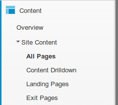
- Change the primary dimension to "Other" -> "Content" -> "Hostname".
 At this point the data table will show your best host names but the graph will still show total page views.
 - If you have more than 10 sub-domains, you may want to show more of them at once. Only the number shown will be included in the graph.
- Select the icon for "Motion Chart" above the graph on the right hand side instead of the currently selected icon for "Line Chart". "Motion chart" is the icon with the three circles on it. (Don't ask me why the line chart I want is under "motion chart" rather than "line chart.")

- Use the tabs on the top right of the graph and select the one with the line on it. You will get the graph that you are looking for.
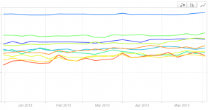


Each of the lines on that graph represents a sub-domain so you can quickly compare how your sub-domains are doing over time. The graph is interactive so you can mouse over it to see data and use the check boxes to the right to highlight rows.

